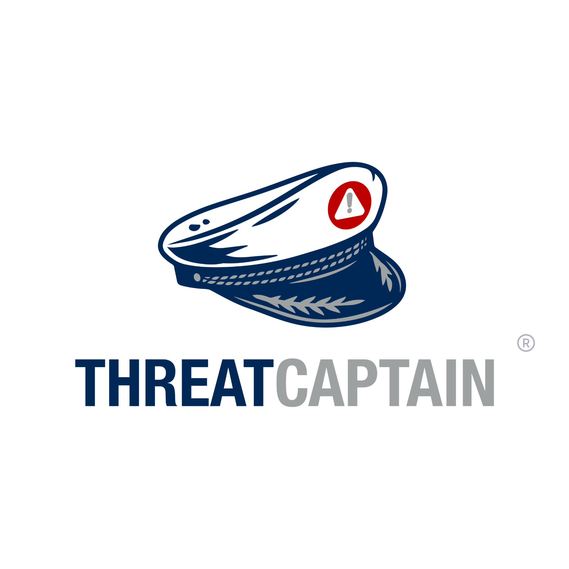
Logos · Stacked
The mark, stacked.
The default ThreatCaptain mark. Use stacked lockups whenever space allows — they carry the most brand presence.
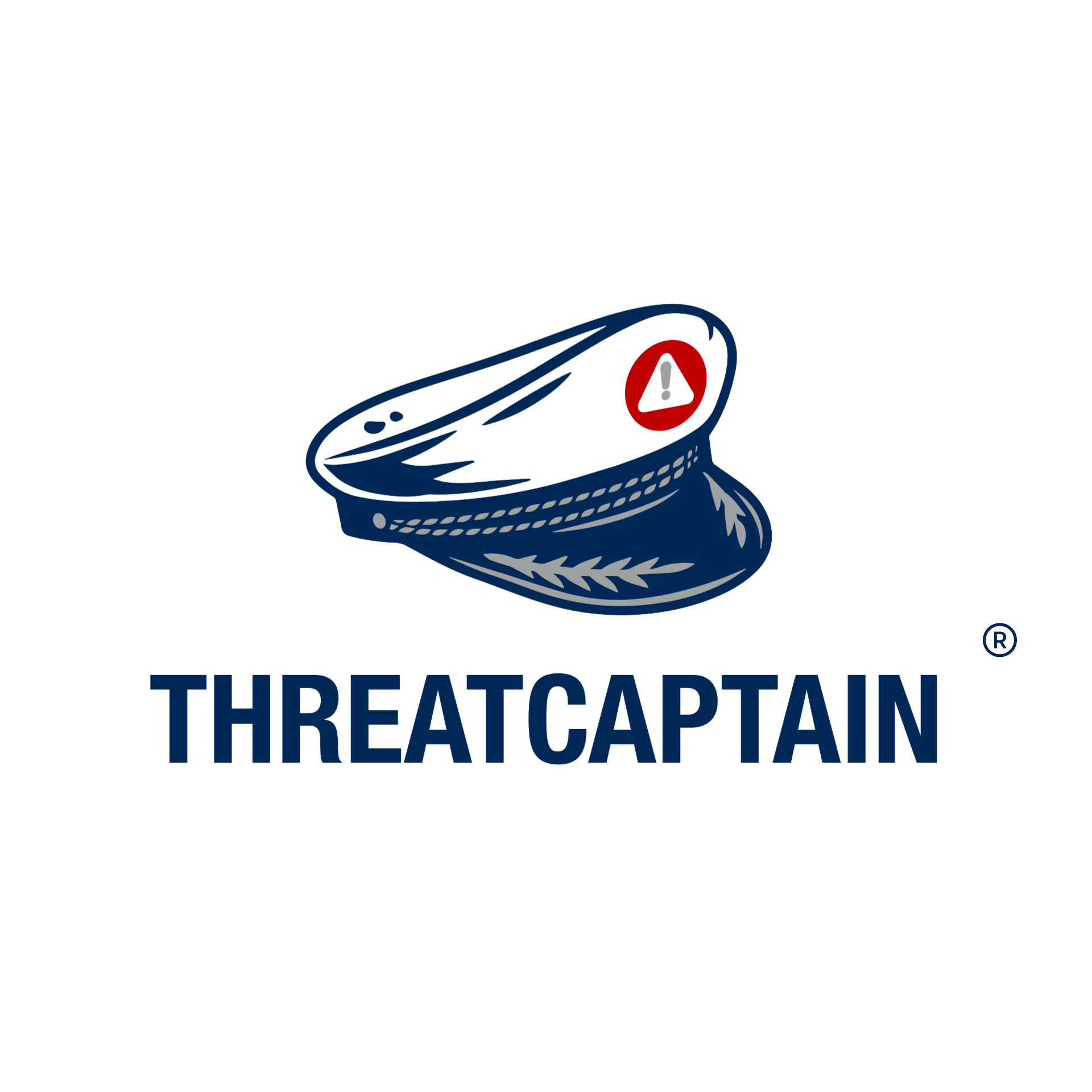
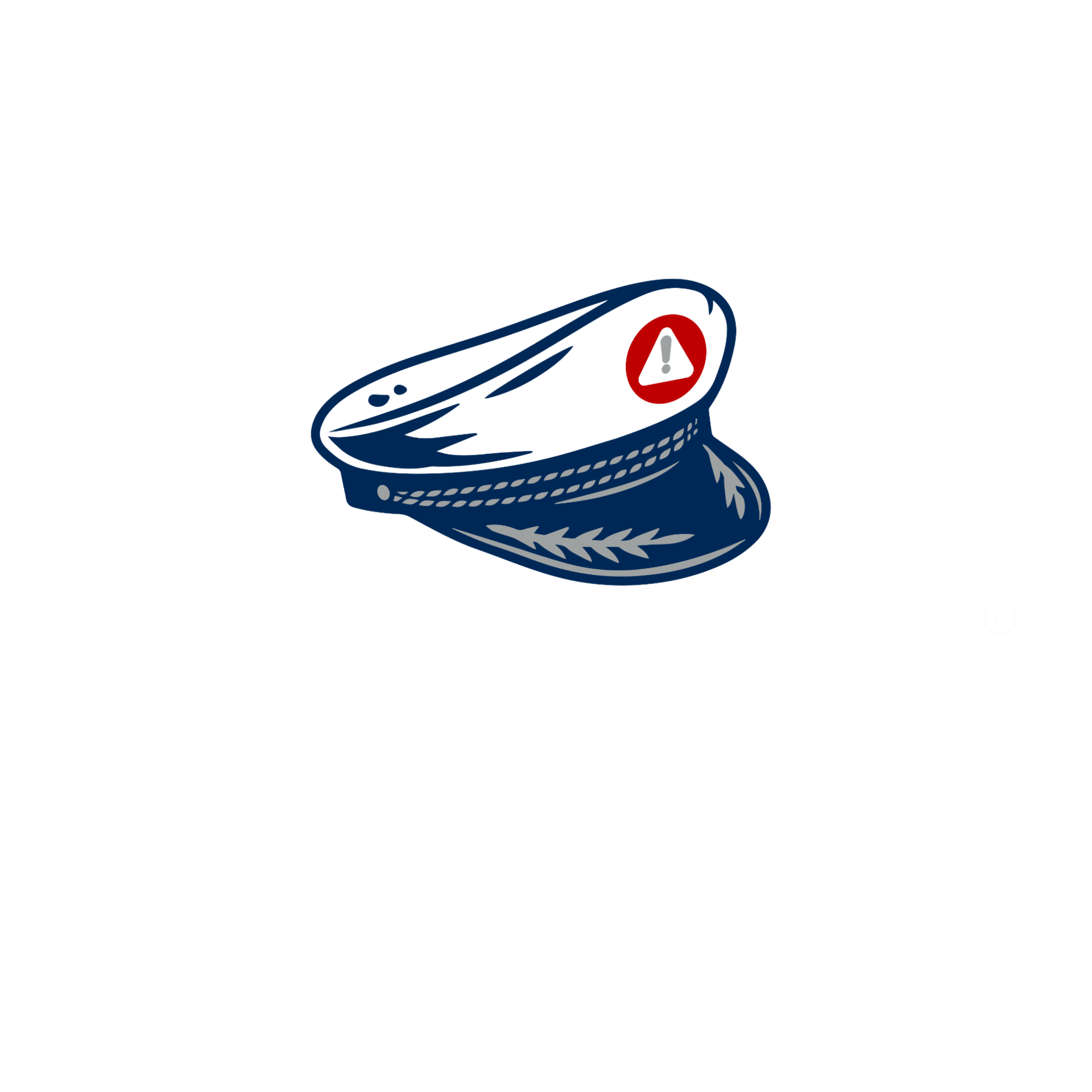
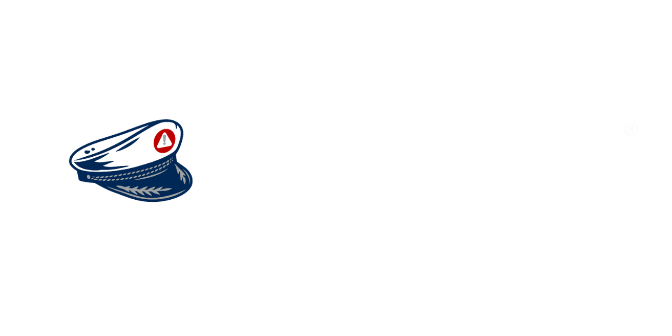
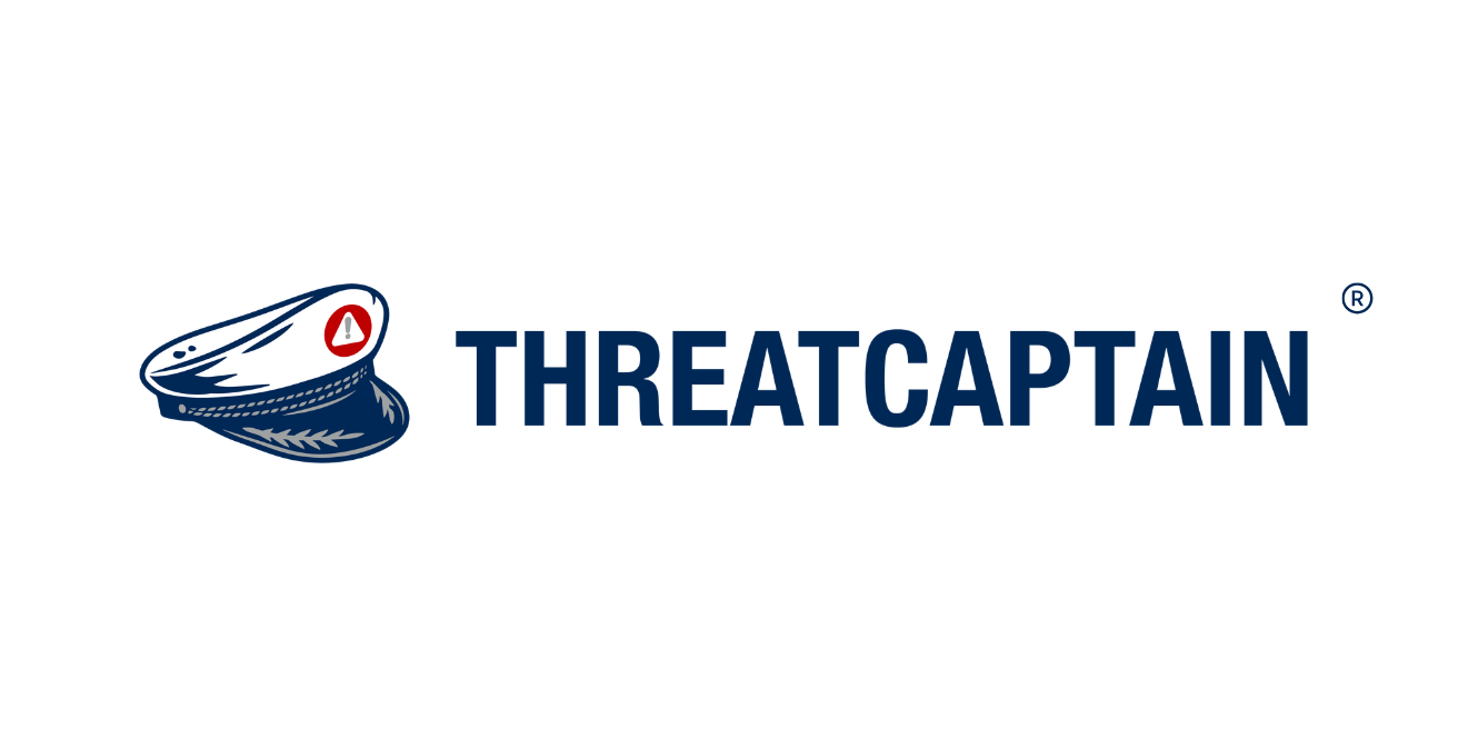
Logos · Horizontal & Icon
Tight spaces. Same brand.
Use horizontal lockups in headers and narrow placements. The hat-only mark is reserved for avatars, favicons and very tight contexts where the wordmark won't fit.

Sizing & Clear Space
Give the mark room to breathe.
Digital
24px min
Minimum height on screen.
Print
0.5 in min
Minimum height in print.
Clear Space
= cap height
Padding equal to the wordmark cap height on all sides.
Usage
Keep it clean. Keep it ours.
Do
- • Use official artwork files only.
- • Include the ® on the first prominent appearance per page.
- • Maintain clear space and the original aspect ratio.
- • Place on backgrounds with WCAG AA contrast.
Don't
- • Don't re-typeset the wordmark in any other font.
- • Don't apply effects — shadow, glow, or distortion.
- • Don't recolor outside the approved palette.
- • Don't crop, lock to a shape, or break clear space.